Custom type design,
retail fonts,
font engineering,
& tooling
for
Latin and عربي.
Yanone is a one-man type design and font engineering studio based in Berlin, Germany.
I’m specialized in Arabic and Latin type design and font
production.
Have a job to commission? Get in touch.
Previous clients include Bold Monday, FontShop, Glyphs.app, Google Fonts, Linotype, SYNTAX, Typotheque, and Webtype.
Software
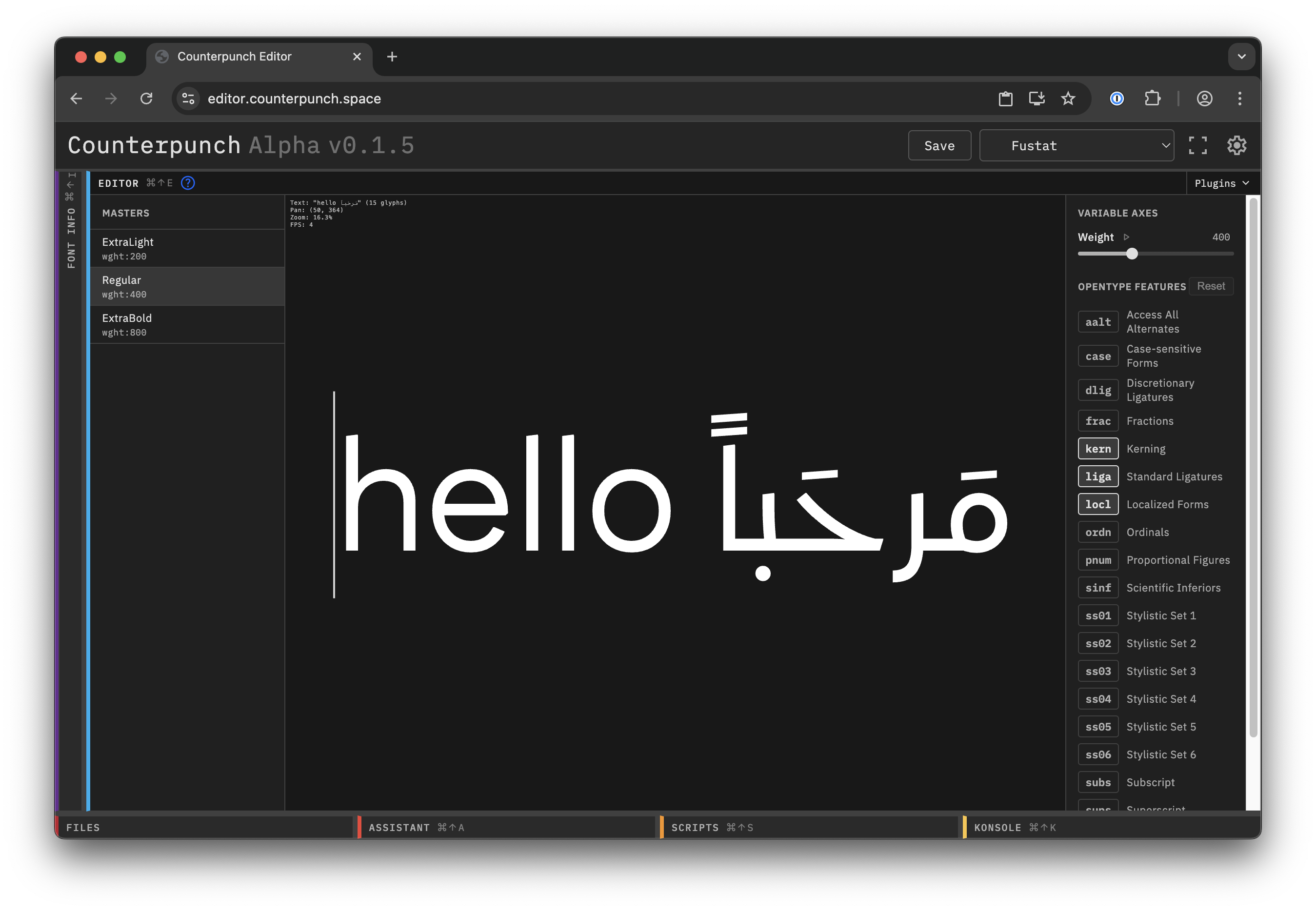
Counterpunch
Counterpunch is the font editor I have always wanted to use: a tool for drawing, spacing, and iterating across complex writing systems directly in the browser.
I am the principal engineer behind it, and I built it around the parts of type design that generic vector tools and legacy font editors still handle poorly, especially for Arabic and other scripts that need contextual behavior from the start.
Selected fonts
FF DIN Arabic, FF Antithesis, Runya, FF Amman, FF Kava, Yanone Kaffeesatz
2016
FF DIN Arabic
In 2014 I was commissioned by FontShop International to extend their popular FF DIN typeface family into the Arabic script. FF DIN Arabic was built from a simplified handwritten Naskh skeleton on a grid and refined into a family that matches the clarity and legibility of the Latin DIN and FF DIN.
By the time the work began, FF DIN Thin had already completed the Latin range, so FF DIN Arabic could be drawn as a full family of seven weights. The release also added stylistic dot variants and broad contemporary language coverage for multilingual branding, packaging, and corporate design.
The original page also highlighted the Granshan special mention, FontShop’s best-of-2016 recognition, and detailed notes on the design process and supported languages.


2014
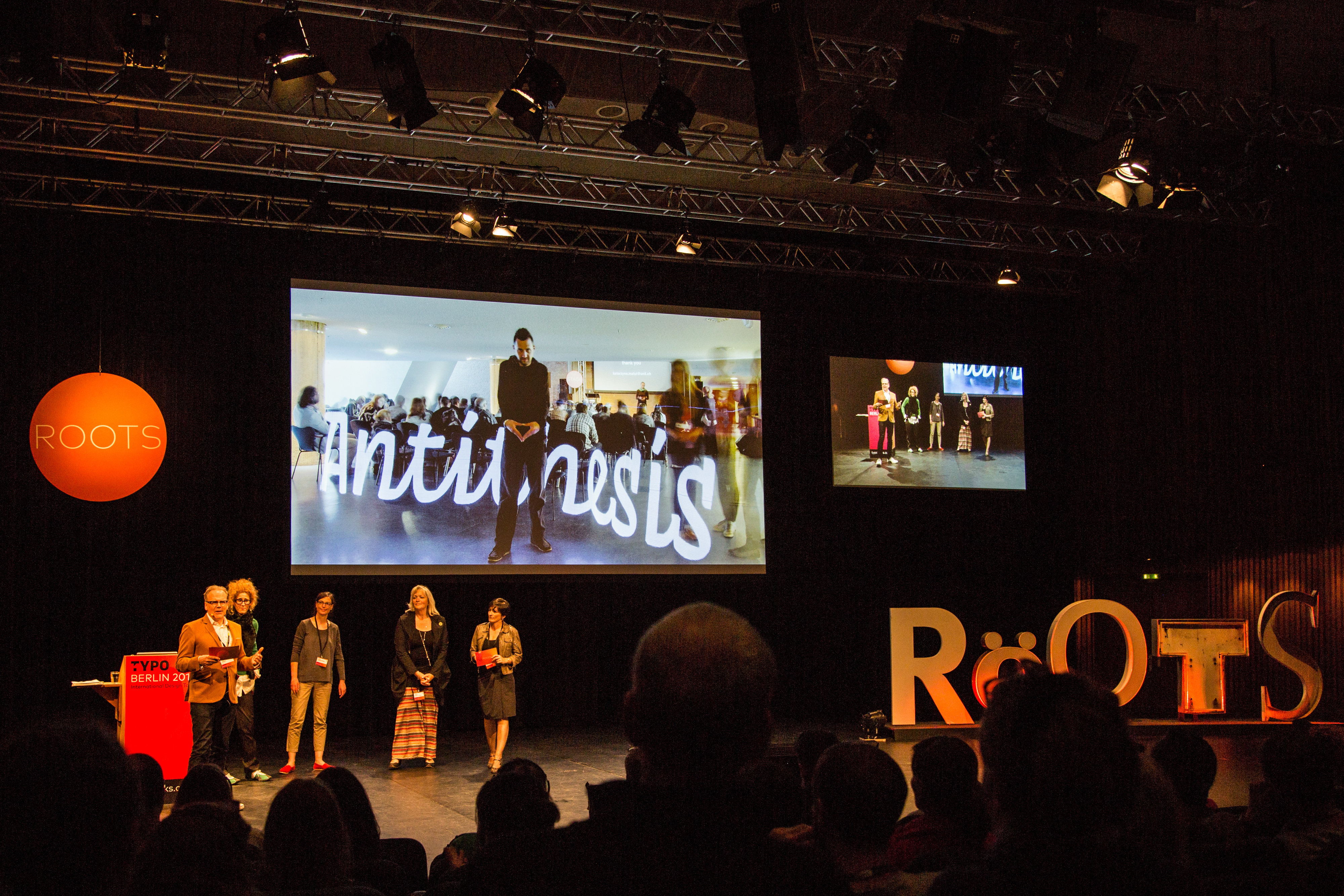
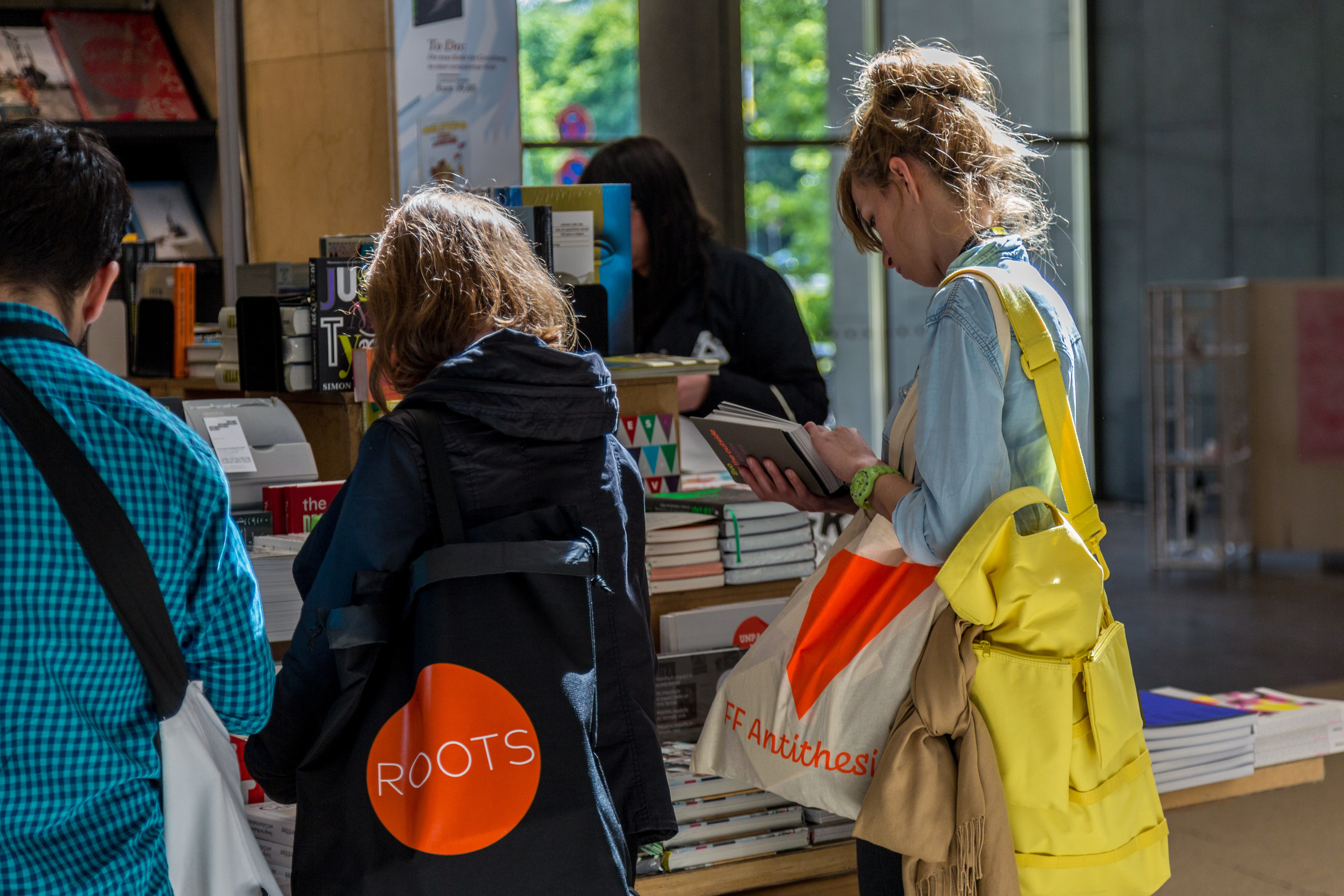
FF Antithesis
FF Antithesis is based around tension between three unequal poles: a slabby serif regular, a connected script italic, and a rather fat sans bold. Each accompanies the others to create deliberately high visual contrast.
It was Yanone’s graduation project for the Type & Media masters in The Hague and the live site paired it with exhibition notes, awards, and motion work.


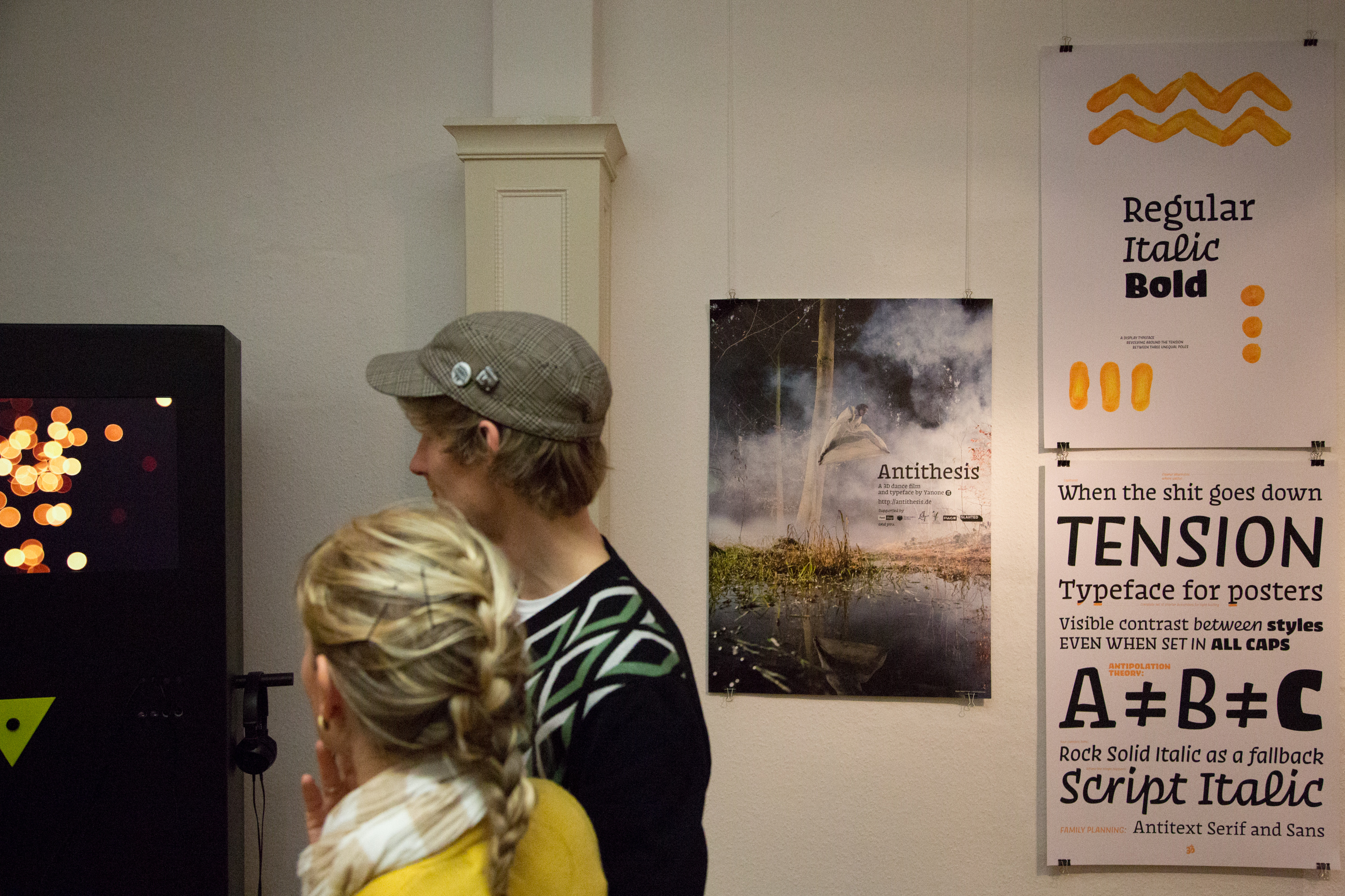
Find on MyFonts · antithesis.de · Typographica review · TYPO Berlin teaser · BesserMitfahren
2013
Runya
Runya started as a two-day side project and a playful excuse to make a proper hipster font. It supports Arabic, Farsi, and Urdu, and intentionally skips Latin altogether.


2010
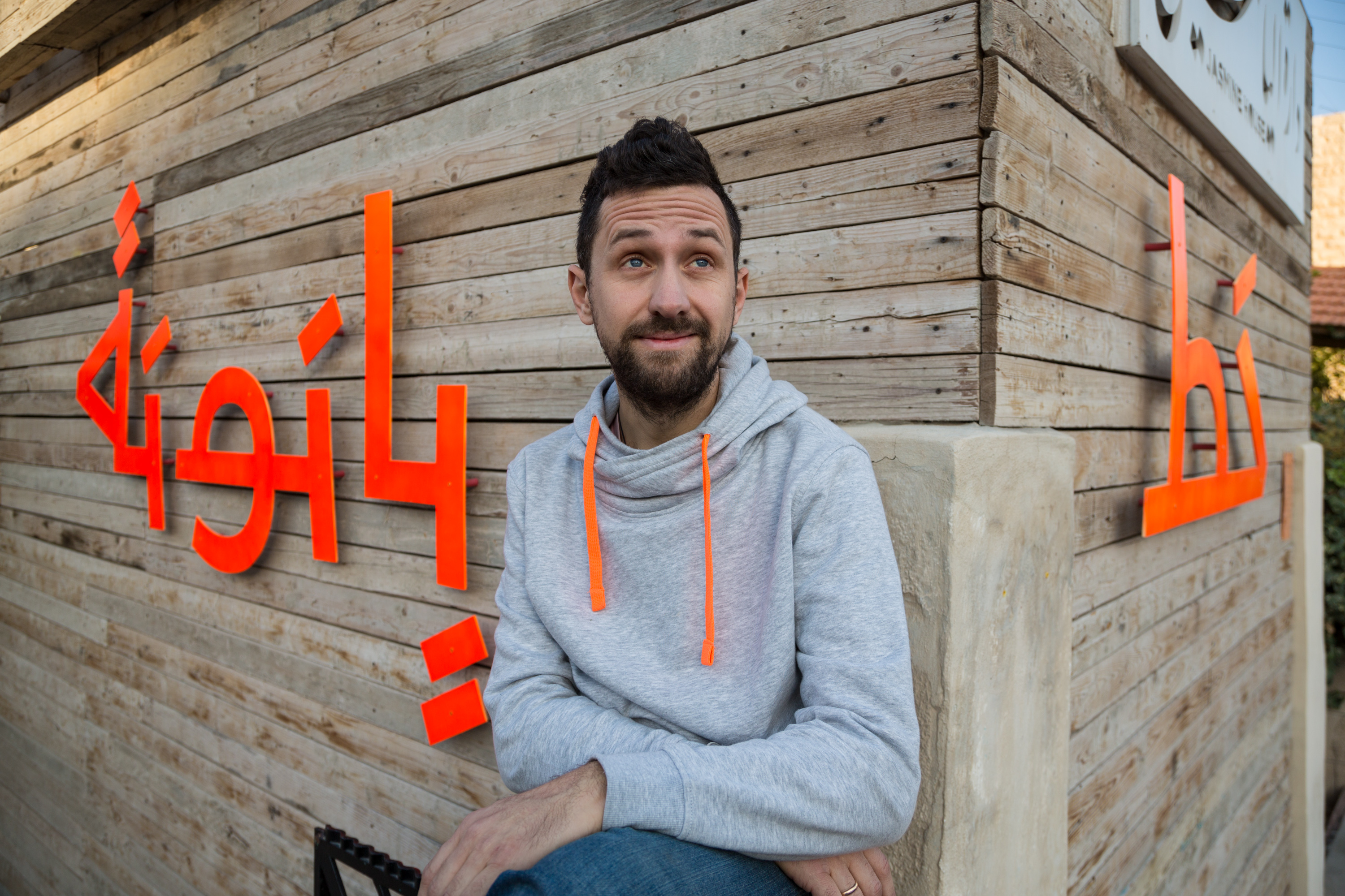
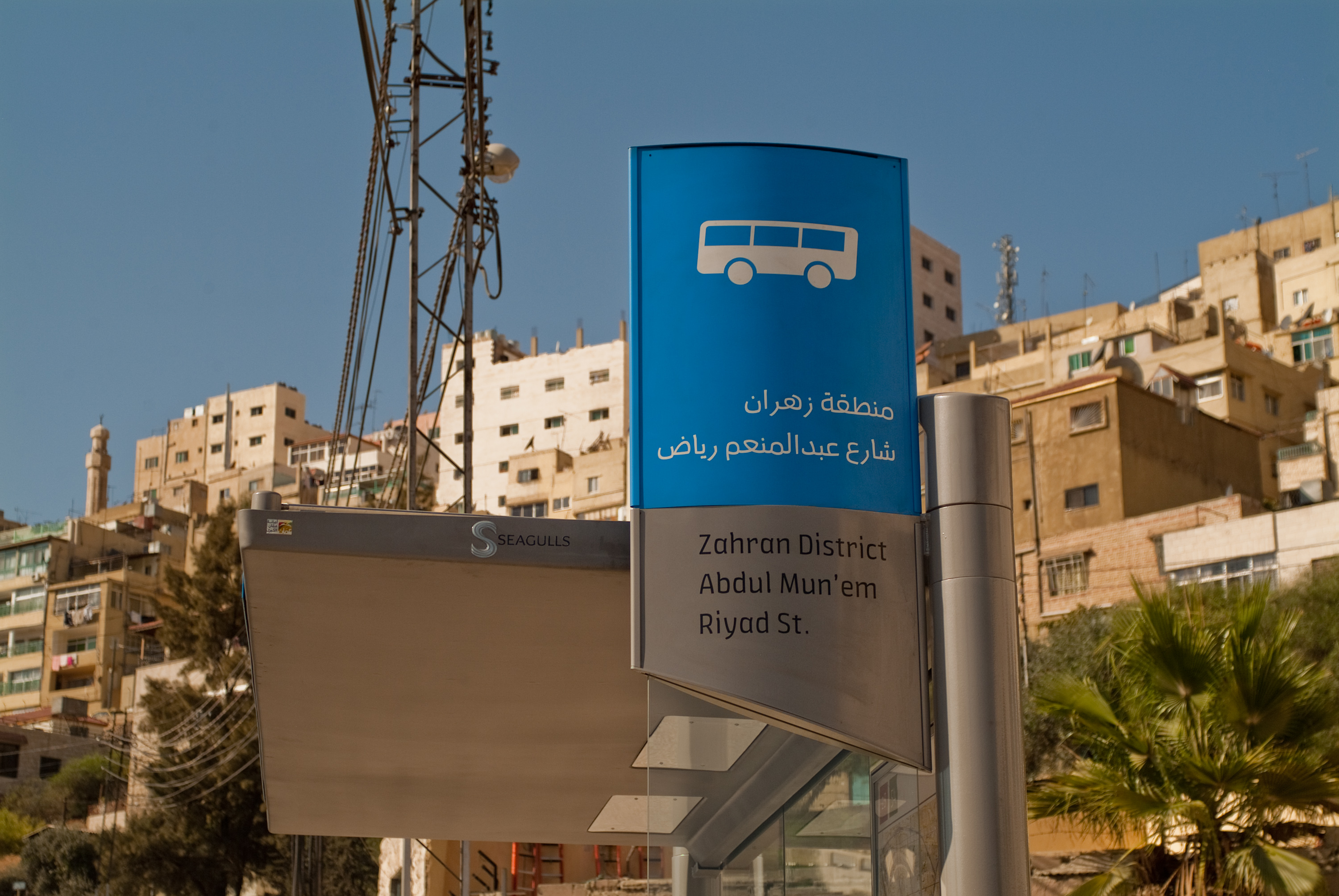
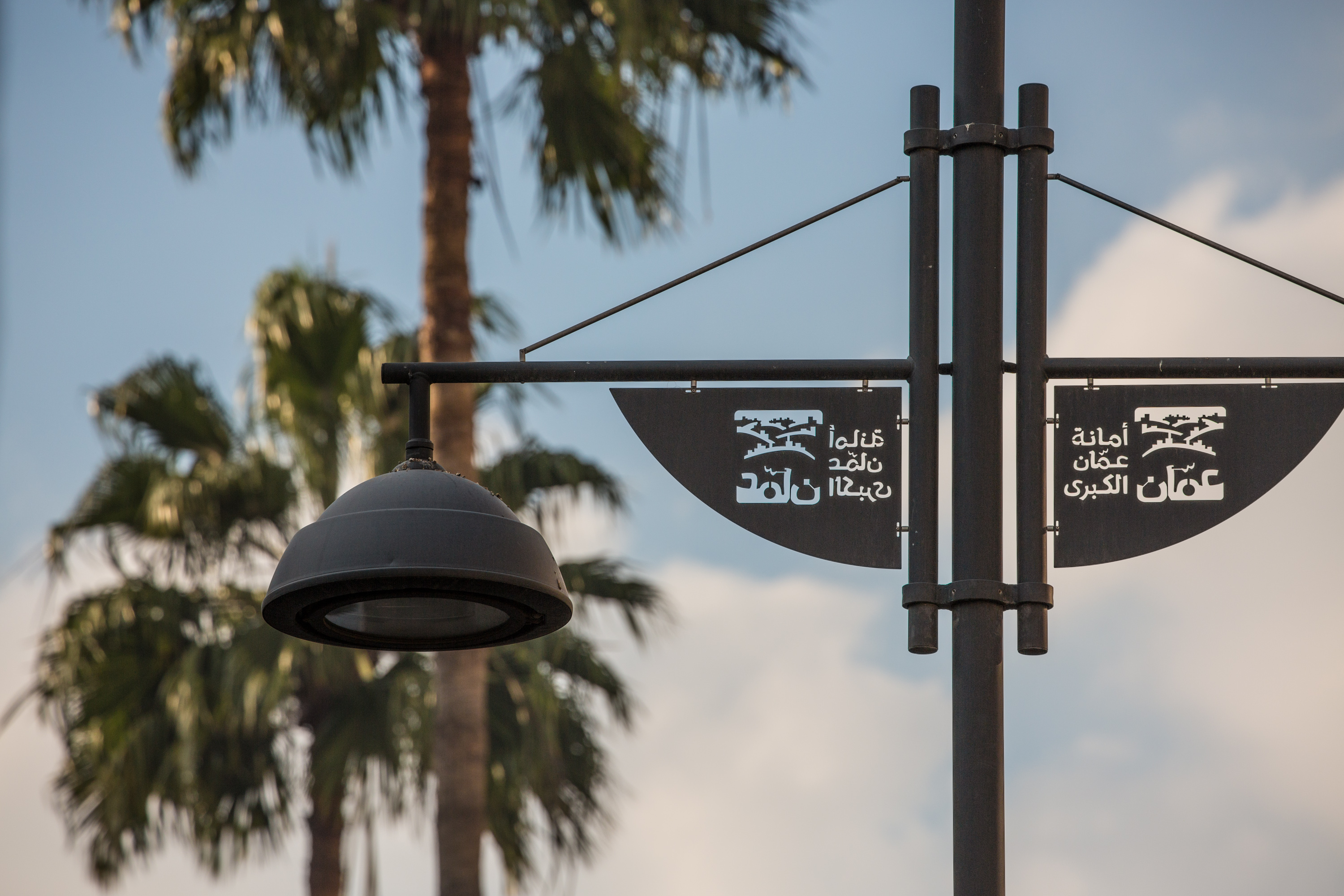
FF Amman
In 2008 and 2009 Yanone worked with the Amman-based branding office SYNTAX to develop a custom Arabic and Latin family for the branding of Greater Amman Municipality, the capital of Jordan.
The project was also his graduation work at the Bauhaus-University of Weimar.


2010
FF Kava
FF Kava began as the free typeface Kaffeesatz, published in 2004 during the early stages of Yanone’s type design career. The bold weight referenced 1920s coffee-house grotesks while the lighter styles bridged into more contemporary sans-serif territory.
The current FF Kava family is a carefully revised, more rounded version of Kaffeesatz. It adds a black weight, small caps, and broader figure sets to turn the original idea into a more complete retail family.

2004
Yanone Kaffeesatz
First published in 2004, Yanone Kaffeesatz was Yanone’s first finished typeface. Its bold is reminiscent of 1920s coffee-house typography, while the thinner weights bridge toward the present.
Released freely, it spread widely and was later reworked into FF Kava.